Manga coloring
Started by uv12345, Nov 28 2006 11:32 PM
6 replies to this topic
#1

Posted 28 November 2006 - 11:32 PM
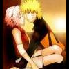
Im thinking about joining zarosaki but i wanted your opinion heres a dirty 30min picture i colored

#2

Posted 29 November 2006 - 12:30 AM
Awesome stuff! Sorry i dunno what zarosaki is tho =/, but if it means you get to do more of these for us to see..i say go fer it! :thumbs:

To disgrace oneself is something a samurai should never do.
#3
 Guest_Lady_Sakura101_*
Posted 29 November 2006 - 01:44 AM
that some good art!
#4

Posted 29 November 2006 - 02:23 AM
It's not bad, the coloring of Naruto's jaket (the orange part) is colored nicely. Also, his hands are colored well, too.
The lighting on the black sleeves doesn't match the line very well. The use of the paintbrush with white isn't very well integrated. Naruto's skin tone may be a bit on the dark side, simply considering the intensity of the blue sky behind him. It's obviously really bright out, and his skin looks like it's in a rather dark room. (Since we know Naruto is a cute little white boy with blonde hair. That coloring would probably be more appropriate in a darker setting.
I'm not completely convinced by the clouds in the sky. It looks like a filter was used, but they work for the short time frame that this was colored in.
The coloring of the sphere is really well handled, but I wonder if it's a little too well handled for the context of an anime. Granted, a lot of animation studios are adding in 3-D effects into anime, but it usually isn't integrated very well. When it is, it's amazing, but very difficult to do.
I noticed that you didn't clean up the gradiants of the hands and jacket. It may help to clean up the color if you do.
The shading on the hands was handled nicely. I actually wouldn't mind if it was pushed even more. More intense lighting would be exciting to see.
Overall, not a bad coloring job. Just needs a little bit of touchups and cleanups. :thumbs:
(Ehehe....I go to Minneapolis College of Art and Design. We spend hours upon hours a week critiquing and making new work. I can't help it with these long winded overviews... )
)
The lighting on the black sleeves doesn't match the line very well. The use of the paintbrush with white isn't very well integrated. Naruto's skin tone may be a bit on the dark side, simply considering the intensity of the blue sky behind him. It's obviously really bright out, and his skin looks like it's in a rather dark room. (Since we know Naruto is a cute little white boy with blonde hair. That coloring would probably be more appropriate in a darker setting.
I'm not completely convinced by the clouds in the sky. It looks like a filter was used, but they work for the short time frame that this was colored in.
The coloring of the sphere is really well handled, but I wonder if it's a little too well handled for the context of an anime. Granted, a lot of animation studios are adding in 3-D effects into anime, but it usually isn't integrated very well. When it is, it's amazing, but very difficult to do.
I noticed that you didn't clean up the gradiants of the hands and jacket. It may help to clean up the color if you do.
The shading on the hands was handled nicely. I actually wouldn't mind if it was pushed even more. More intense lighting would be exciting to see.
Overall, not a bad coloring job. Just needs a little bit of touchups and cleanups. :thumbs:
(Ehehe....I go to Minneapolis College of Art and Design. We spend hours upon hours a week critiquing and making new work. I can't help it with these long winded overviews...
#5

Posted 29 November 2006 - 04:27 PM
Thanks for pointing out the errors... its really hard and time consuming to zoom in like 52095787049x and fix
every little pixel. i just got photoshop yesterday so i dont know much of its feature. im more used to fireworks. But anyways at least i know true opinions
Zarosaki is a group who colors naruto manga which make it look much more vibrant. Although the picture i colored may seem good to some people , it would be nothing compared to zarosaki's art.
every little pixel. i just got photoshop yesterday so i dont know much of its feature. im more used to fireworks. But anyways at least i know true opinions
QUOTE (ia3 @ Nov 29 2006, 12:30 AM) <{POST_SNAPBACK}>
Awesome stuff! Sorry i dunno what zarosaki is tho =/, but if it means you get to do more of these for us to see..i say go fer it! :thumbs:
Zarosaki is a group who colors naruto manga which make it look much more vibrant. Although the picture i colored may seem good to some people , it would be nothing compared to zarosaki's art.
#6

Posted 29 November 2006 - 10:53 PM
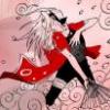
YEA i got another one done, only this one is much more detailed and carfully colored i also did some major editing so dont mind the uncolored naruto symbal.


#7
 Guest_jtl889_*
Posted 30 November 2006 - 01:29 AM
WOW what you did with the rasengan is.... WOW
0 user(s) are reading this topic
0 members, 0 guests, 0 anonymous users


 This topic is locked


